Coupa Spend Guard
Project Title:
Coupa Spend Guard: Suspicious Spend Preview
Turning an invisible AI feature into an upgrade engine
Outcome:
By redesigning the Suspicious Spend Preview, we increased how often customers discovered and engaged with Coupa’s AI-powered fraud detection, which led to a measurable uptick in upgrades to the Spend Guard add-on.
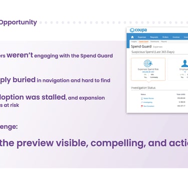
The Problem:
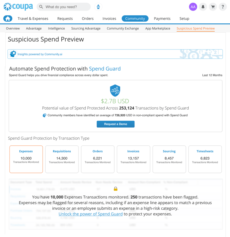
Spend Guard’s value depended on one thing: customers noticing and trusting its AI-generated fraud insights. The preview lived deep in the suite, surfaced generic data, and failed to answer a simple question for procurement and finance leaders:
“Is this worth paying extra for?”
Who I designed for:
Primary: Procurement and finance leaders evaluating whether to add Spend Guard to their plan.
Secondary: Existing customers who had access to the preview but had never meaningfully interacted with it.
They needed a quick, low-risk way to see suspicious patterns in their own spend data and understand the potential impact if they did nothing.
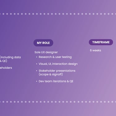
My role:
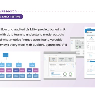
As the Senior Product/UX Designer on Spend Guard, I led the UX strategy, IA changes, and interface design for the new preview experience, working with PM, data science, and engineering to keep the solution technically feasible and aligned with the pricing/packaging model.
What I did:
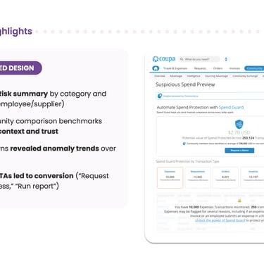
Made the preview discoverable
Simplified navigation and renamed entry points so the preview sat alongside other “risk & insights” tools instead of being buried in a secondary tab.
Added contextual links from high-traffic dashboards where customers already reviewed spend anomalies.
Turned raw AI output into a story
Partnered with data science to select a small set of high-signal indicators (e.g., suspicious suppliers, out-of-policy categories, abnormal invoice patterns).
Designed a summary strip that answered, at a glance: “Here’s where your money is at risk today.”
Used progressive disclosure so leaders could drill into a few concrete examples without being overwhelmed by tables or model details.
Aligned the experience with upgrade intent
Framed the preview as “a limited look at what Spend Guard will monitor continuously,” so the UI set expectations without feeling like a hard sell.
Designed an upgrade CTA that appeared only after users had explored their own suspicious spend, keeping the focus on insight first, upsell second.
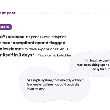
Impact:
Post-launch analytics showed:
Higher discovery of the Suspicious Spend Preview within the Coupa suite.
Longer, deeper engagement with suspicious spend data (more users exploring examples rather than bouncing).
A measurable lift in customers upgrading their plans to include Spend Guard.
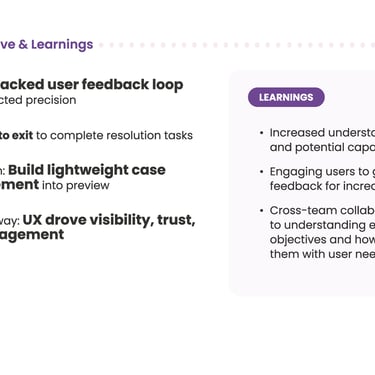
What this reinforced for me:
AI features only drive value when people can find them, trust them, and see the business risk in plain language.
In enterprise SaaS, UX is often the bridge between “we have powerful models” and “decision-makers are willing to pay for them.”
This project shaped how I now approach AI-driven experiences in my work and in my book: show the real problem, make the insight unmistakable, then get out of the way so the business decision is easy.
Visuals
A visual presentation-ready case study version of the project

Social: