

Coupa Mobile
Approvals On the Go
The Problem:
Coupa's mobile app was being built out feature by feature, porting the highest-value desktop workflows one at a time rather than launching with full parity. PTO approvals didn't exist on mobile yet, so there was nothing to fix: the job was deciding from scratch what this workflow should look like on a phone.
The app also had no shared interaction model. Features that had already moved to mobile had each solved "where do primary actions live" a little differently. Whatever we built for approvals would either add to that inconsistency or start fixing it.
Who I designed for:
Primary: Managers and approvers clearing PTO requests, expense reports and receiving tasks in short sessions, often between meetings.
Secondary: Employees doing lighter tasks like shopping the catalog, where the same action pattern had to hold up.
Both needed to understand what was being asked and act on it in a few taps, without relearning the interface on every screen.
What I did:
Made the comment part of the decision
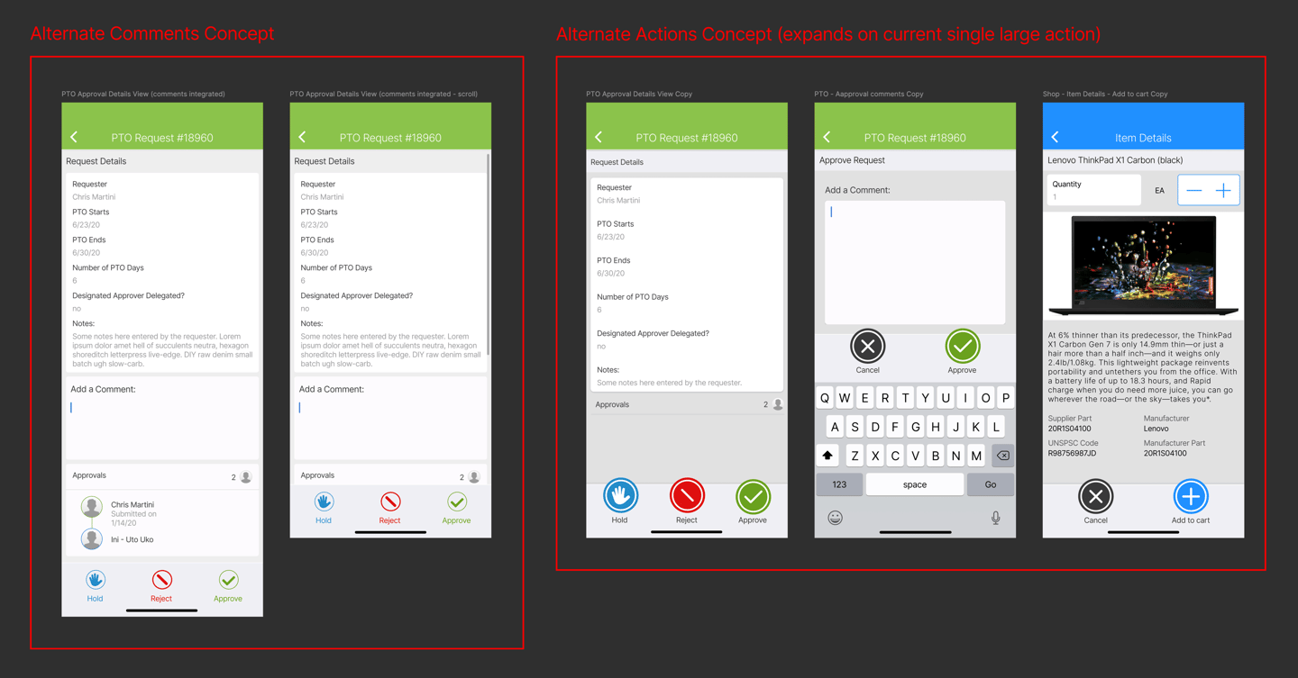
An early version put "Add a Comment" inline on the request screen, where it competed with the requester's notes and approval history and was easy to skip. I moved it to a dedicated step: tapping Approve, Reject or Hold opens a comment field that has to be filled in before the action commits.
Defined one action bar
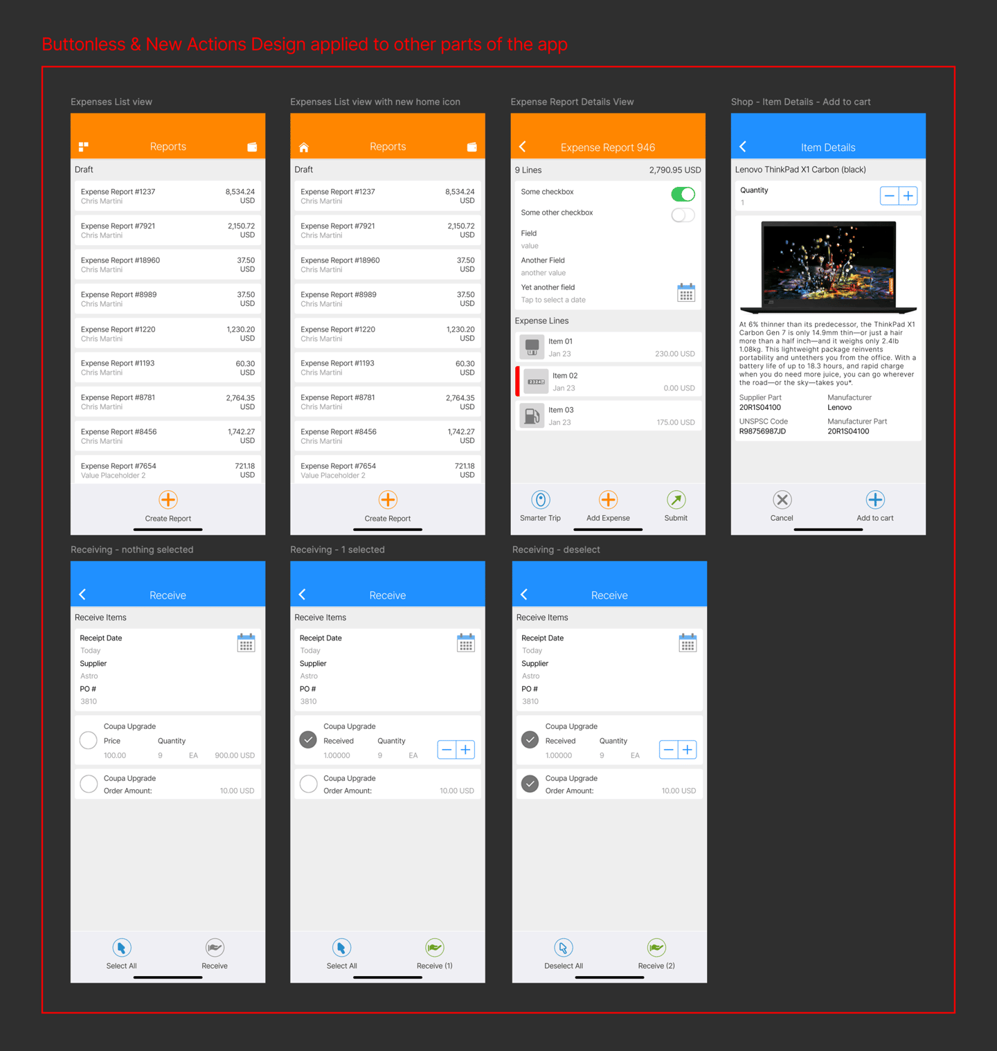
A persistent bottom bar with two or three clearly weighted buttons, color-coded by intent: green to approve or confirm, red to reject or cancel, blue for neutral or hold. Icon and color variations went through design review screen by screen until the team converged on one pattern that read clearly at a glance.
Stress-tested it across the app
I carried the pattern into Expenses (Smarter Trip, Add Expense, Submit), Receiving (Select All, Receive) and Shop (Cancel, Add to Cart), adjusting labels to stay meaningful in context. For example, "Receive" became "Receive (2)" once items were selected.
Tradeoffs:
A required comment over an optional one. The dedicated step adds an extra screen and a mandatory field. In exchange, comments stopped being an afterthought and became part of the decision record every time. That matters most on mobile, where approvers move fast and skip anything optional.
Live variations over an early lock-in. The differences in icon weight, color and button style across screens were deliberate, not sloppy: we kept two or three variations in front of the team until one held up across Approvals, Expenses, Receiving and Shop. Slower up front, but it's why the final pattern held together everywhere.
Impact:
I was moved to another project at about 80% completion, so I don't have adoption or usage numbers for this one. This case study focuses on the design decisions and tradeoffs instead.
What this reinforced for me:
Consistency isn't only visual. It lowers the cost of "where do I act?" every time someone opens the app. When an approver has ten seconds between meetings to clear a PTO request, a predictable action pattern does more for usability than any single screen's polish.
Outcome:
Designed the PTO approval flow for mobile from scratch and used it to prove out a consistent action pattern the app had been missing. Then extended that pattern across Expenses, Receiving and Shop, so approve, reject, hold, confirm and cancel work the same way in every part of the app.
Visuals
Social: